
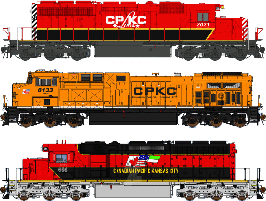
Over the past two years there have been a number of livery drawings produced (see below) since the
announcement of Canadian Pacific and Kansas City Southern combining to form the first North American railway serving
Canada, America, and Mexico directly.
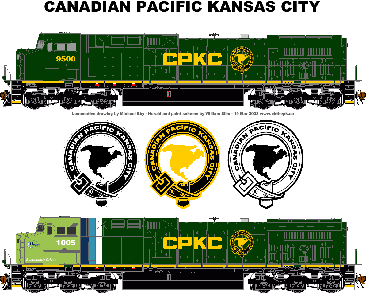
Here's my version to consider, typically one might choose the colour red, but a dark green was chosen for 3 reasons,
for one reason red tends to fade, secondly, mainly to be distinctive.
No other Class One North America railway is using green.
Thirdly, a dark colour should look better with the addition of dust and grime while the solid colour would be simple
to apply without adding multiple colours and/or stripes.
Perhaps less costly, too.
Also included with the submission is the herald, an image of North America circled by a belt representing the
railway holding all three countries together.
The belt being a quiet tribute to the original Scottish investors and directors who incorporated Canadian Pacific Railway
Limited back in 1881.
Now, if only there was some way to weave-in a tribute to the American-born Van Horne...
William Slim.
(likely no image with original article)
(usually because it's been seen before)
provisions in Section 29 of the
Canadian Copyright Modernization Act.